Introduction
Color enhances the design and appearance of information on the web. Although color may be a great tool to visually convey information, it may also create accessibility barriers. When color is utilized on a web page, to ensure accessibility, the right color contrast must always be identified and color should never be the only means to convey information.
Color Contrast
When using color, it is important to have sufficient contrast between two colors: the background color and foreground color. Low contrast colors will make it difficult for visual users to read and/or understand the content (text or images of text) on the page. Color contrast guidelines indicate that there should be at least a 4.5:1 ratio between the foreground content and the background content. However, this guideline is not applicable if:
- The content is large. If the text is large enough to exceed 18 pt. font size or 14 pt. font size if bold, a contrast ratio of 3:1 can exist.
- The content is decorative
- The content part of a logo or wordmark
Why is this Important?
Color is one of the most important elements of a webpage. It can attract users and assist in conveying information. Ensuring websites have high enough contrast between the foreground and the background is significant. Users with color vision impairments or low visibility may find difficulty in viewing an item with low color contrast. Good color contrast increases the user's readability and ensures they have a positive experience when viewing content.
Best Practice
- Sufficient color contrast should be provided (at least 4.5:1 ratio) for regular text.
- If the text is large, a color contrast ratio of 3:1 can be provided
- Black text on a white background has the highest readability.
- Warm and cold colors make for the best color contrast.
- Use color palettes to find correct color contrast combinations. Viget provides users with a pallet of different types of tints, tones, and shades.
Examples
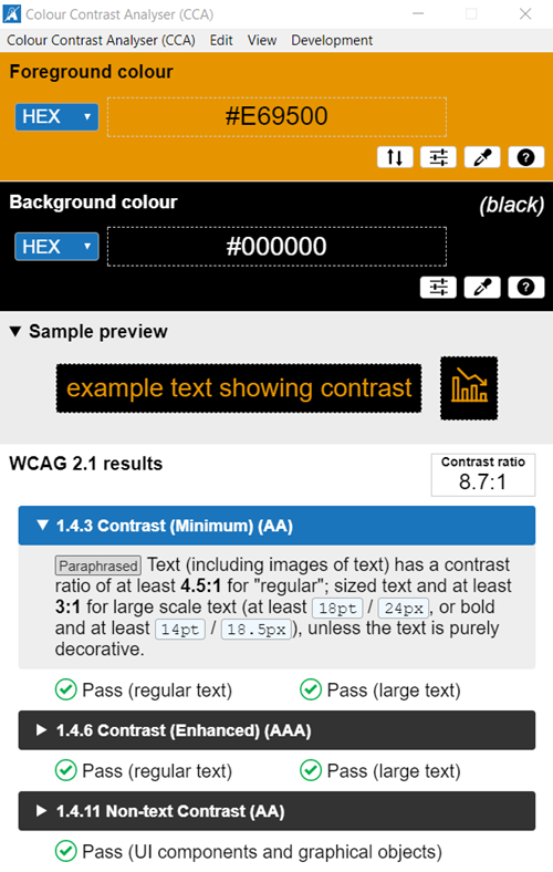
Good Example of color contrast
In the example below the Colour Contrast Analyser tool is used to test the foreground color (black text) against the background (orange). This pairing passes the WCAG 2.1 guidelines with a contrast ratio of 8.7:1. The contrast is sufficient for those who have color deficiencies.

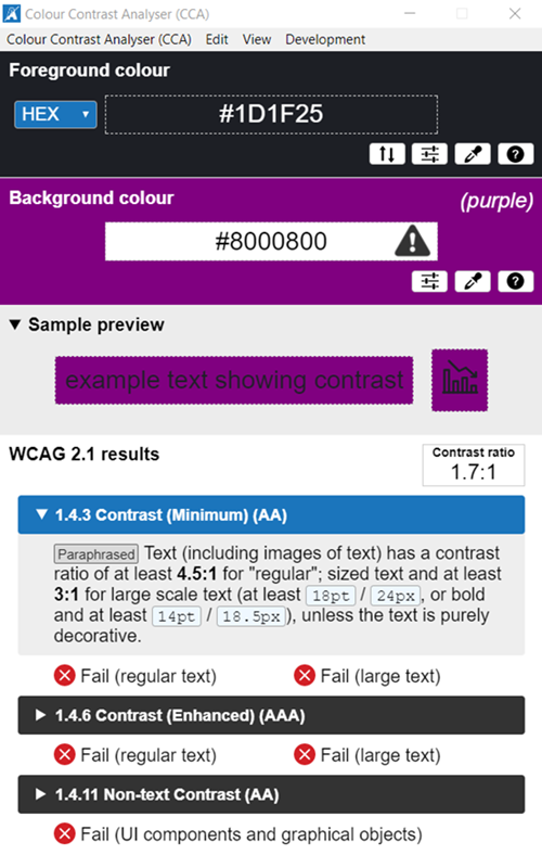
Bad Example of color contrast
In the example below the Colour Contrast Analyser tool is used to test the foreground color (black text) against the background (purple). This pairing fails the WCAG 2.1 guidelines at all levels with a contrast ratio of 2.2:1. People who have low vision or colorblind could encounter some difficulty distinguishing text color from a background color if the contrast is insufficient.

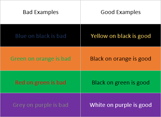
Example of Good and Bad Color Contrast
This is an example of good and bad pairings of different colored text on different colored backgrounds.

Testing Methods
Manual/ Visual Review
- Visually examine the use of color on a website. Ensure that text and images are not difficult to read.
- Identify if a website contains color only objects or text.
Automatic Testing Tools
Color Contrast Tools
WebAIM WAVE Toolbar*
- Activate the WAVE Toolbar
- Navigate to the "Contrast" menu
- Verify that there are no contrast errors
- Use the Contrast Tools to test if text passes color contrast standards.
*Note: Color contrast errors on WAVE do not account for background images, gradients, etc. they must be manually tested.
Colour Contrast Analyser
The Colour Contrast Analyser is a downloadable tool that can be used to test color contrast errors on an operating system. Users can select an item to identify its foreground and background color. The tool then notifies the user if the item passes color contrast standards.
