 This page contains a compiled list of tools that support the creation and assessment of universally designed materials and tools for learning and testing. Some tools listed are available to download as extensions, toolbar for browsers, stand-alone applications or as online web applications. Departmental technical assistance may be required to install these tools.
Eight-Point Accessibility Evaluation
Describing Images
What is Alt Text?
The purpose of Alt Text is to allow low vision or blind users who use text-to-speech assistive technologies (AT), such as screen readers, to understand the purpose of graphic images. Sighted users usually don’t see alt text unless they use AT.
- Screen readers and other AT can’t convert images into texts. So, when writing alt text, consider the following for images:
Describe the content and the purpose of the image clearly and concisely, in a phrase or a sentence or two. Keep alt text short 200 characters or less.
- Image with text (for example, the CSUN wordmark) should include the words on the image.
- “Image of…”, “Photo of…” is not needed because screen readers and other AT announce that it’s an “image” or “graphic”.
- When completing the alt text, use proper punctuation such as periods to indicate the end of the alt text. Without proper punctuation, some screen readers will run the alt text into the body text that follows and cause confusion to the user.
- Don’t insert hyperlinks in alt text because they are not clickable and can’t create descriptive link text.

Screen readers and other AT announce that it’s an “image” or “graphic”, then read the alt text: “Three plants going through transformation with text quote Accessibility user-friendly document for CSUN student success.”
Image Captions
- Captions are universal and accessible for everyone.
- Captions are read and visible to all users whether they use assistive technologies (AT) or not.
- Captions and alt text have different purposes:
- Captions convey what’s visible in the image.
- Alt text describes the visual aspect of the image and should be brief.
- If captions and alt text are similar in their descriptions, alt text can be “Mark as decorative” to be ignored by the screen readers.
- Don't repeat the image's caption as the alt text. People don't need to hear the same information twice.

Caption: crowd of people walking and shopping at an outdoor market.
Alt text: Mark as decorative
What are Decorative Images?
- Conveys no information; does not provide meaningful information.
- Purely for visual effect.
- The horizontal line that divided the two sections.
- Line border image used as part of page design.
- Decorative images, lines, borders, or shapes ignore by assistive technologies, such as screen readers.
How to Describe Images?
[Images courtesy from various websites]
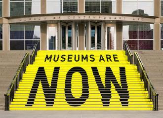
A stair chase leading up to an entryway is painted yellow with bold black text that reads museums are now.

On the left is the book cover for Haben The Deafblind Woman Who Conquered Harvard Law, and on the right is the quote: “In the Tigrinya language of Eritrea and Ethiopia, Haben means 'pride.’”

Woman holds hands up forming signs while another woman looks on.

Michelle Obama claps and Barack waves.

A hand reaches out of a computer screen giving the hand gesture for stop. The screen reads 'access denied!'

Student holds a diploma hardcover up in the air during CSUN commencement. Caption text "and together, as Matadors, we will move mountains."

University Library displaying the banners that spell C S U N
Images of Text
Screen readers and other assistive technologies (AT) can’t convert images of text into texts. If the flyer is an image of text, add descriptive text in Alt Text.

Alt text: A chalkboard with the text "I learned so much! Thank you : )"
Complex Image
Some images, such as graphs, charts or informative illustrations require fairly lengthy explanations to make them accessible. Provide a brief alt text description of the image and a longer description within the text of the document. This may be helpful for others as well since some people have difficulty understanding charts and graphs. Image caption benefits everyone.

Alt text: Website Accessibility Assessment Chart - Description in the text below.
Image caption: Website Accessibility Assessment of All Organizational Chart. Findings from the assessment indicate the following: 5% of organizational websites had fewer than 2 errors on the home page; 20% had 3 to 5 errors; 45% had 6 to 10 errors; and 30% had more than 10 errors on the home page.
Note: Do not repeat the image captions in the Alt text because the screen readers will repeat the same info.
More examples of how to describe images
- UDC Best Practices for Describing Images
- How to Describe Images (Art, Chemistry, Diagrams, Flow Charts, Formatting & Layout, Graphs, Maps, Mathematics, Page Layout, Tables, Text-only images)
- Periodic Table of the Elements
- Map Accessibility: Map Design, Static Maps, and Interactive Web Maps
Alt Text for Complex Images using Artificial Intelligence (AI)
Some images are easy to describe but many are not. For charts, graphs, infographics, artwork, and other complex images, artificial intelligence (AI) will generate the first draft of the alt text, making it easier and faster for you to create the final image description.
Image Accessibility Creator: https://asuo-ai-labs.streamlit.app/Image_Accessibility
Color Contrast
Color can play a significant role in the overall readability of a document. First, the use of neon or pastel colors makes content challenging to read with someone who has low vision and/or a degree of color blindness. Additionally, the viewer will be placing a constant strain on the eyes to read the content. Secondly, if colors are used to place importance on instructional materials i.e. which section is highlighted in red, captions or alternative text should be included to note the significance of the colors.
Color Contrast
When using color, it is important to have sufficient contrast between two colors: the background color and foreground color. Low contrast colors will make it difficult for visual users to read and/or understand the content (text or images of text) on the page. Color contrast guidelines indicate that there should be at least a 4.5:1 ratio between the foreground content and the background content. However, this guideline is not applicable if:
- The content is large. If the text is large enough to exceed 18 pt. font size or 14 pt. font size if bold, a contrast ratio of 3:1 can exist.
- The content is decorative
- The content part of a logo or wordmark
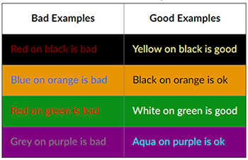
Bad Example of color contrast
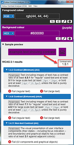
In the example below the Colour Contrast Analyser tool is used to test the foreground color (black text) against the background (purple). This pairing fails the WCAG 2.1 guidelines at all levels with a contrast ratio of 1.5:1. People who have low vision or colorblind could encounter some difficulty distinguishing text color from a background color if the contrast is insufficient contrast ratio 1.5:1. The minimum contrast ratio of 4.5:1 for large text 18 point or 14 point bold.
Good Example of color contrast
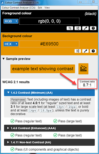
In the example below the Colour Contrast Analyser tool is used to test the foreground color (black text) against the background (orange). This pairing passes the WCAG 2.1 guidelines with a contrast ratio of 8.7:1. The contrast is sufficient for those who have color deficiencies.
Example of Good and Bad Color Contrast
This is an example of good and bad pairings of different colored text on different colored backgrounds.
Download free Colour Contrast Analyser (CCA) checker tool.
Link Color Contrast Checker
For optimal usability and accessibility, links should be underlined. If links are not underlined by default, they may be reliant on color and may fail WCAG 2 Level A. To address this color reliance, you must have a 3:1 contrast ratio between link text color and the surrounding body text color.
- Link text should clearly identify the target of each link. Good link text should not be overly general.
- Make sense when read out of context.
- Describe the destination (document name, website).
- Be unique for unique destinations.
- Do not use click here or read more or continue.
- Do not use different link text to refer to the same resource.
- Do not to use the same link text to refer to different resources.
- Best practice is to bold or underline links.
- Do not use color links as the only method to convey important information.
- Tab order should read from the upper left to the lower right, and make sense to both sighted and visually impaired users.
Direct vs Styles Formatting
| Direct Formatting | Styles Pane Formatting |
|
|
What is Heading Styles?
Headings are styles to give a document structure by category or topic. Without headings, a person using assistive technology like a screen reader cannot navigate by sections, subsections, or scan section titles to understand the document structure.
Heading Styles (Heading 1 through Heading 6) in a logical sequence. Do not skip heading levels i.e. Heading 2 to Heading 4, headings should be in order.)
- Heading 1: Document title or main content heading/title (just one)
- Heading 2: Major section heading
- Heading 3: Sub-section of the Heading 2
- Heading 4: Sub-section of the Heading 3, and so on, ending with Heading 6
- Normal: Paragraph
You can right-click on any style and choose "modify" then customize font, color, size and more...
Note: Title in Word won't recognize when converting to a PDF. Start with Heading 1 for the document title.
Using heading styles means you can also quickly build a Table of Contents, reorganize your document, and reformat its design without having to manually change each heading's text.
Table of Contents
- Headings structure will automatically populate a table of contents and provide accessible for screen readers rely on headings structure to navigate a page quickly.
- Adding Table of Contents to any documents or syllabus over 8 pages to make it easier for readers to go directly to a specific section in the document.
- Recommend to insert page numbers in the footer.
- To create Table of Contents, select the References tab, Table of Contents drop-down list, select Automatic Table 1
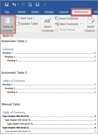
- If you made further changes in your document after insert Table of Contents, select the References tab, select Update Table, Update entire table, OK.
Microsoft Office Accessibility Checker
The Microsoft Office Accessibility Checker scans the document for any potential errors or warnings and provides helpful tips to remedy the issues. The Accessibility Checker scan is helpful to identify inaccessible documents while they are being developed.
Windows:
- Word 365: Select Review tab, select Check Accessibility
- Word 2016: Select File menu, then Check for Issues and select the Check Accessibility from the drop-down menu.
Mac: Select Review tab, select Check Accessibility

The Accessibility Checker results can be categorized by the impact on the viewer:
- Errors: this content will be very difficult or inaccessible to people with disabilities to view
- Example: missing alt text
- Warnings: this content, in most cases, will be difficult for people with disabilities to view
- Example: objects not inline
- Tips: this content is available to people with disabilities, however better organization is suggested
- Example: skipping headings from H1 to H3
When the scan is complete, the results will display on the screen. Click on each error and the document will jump to indicate exactly where the error on the page is occurring. Complete any missing alternative texts, misalignments, headings etc. All errors should be resolved before proceeding.
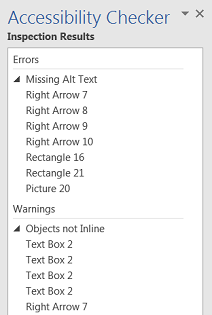
The accessibility checker will identify certain accessibility issues:
- Headings that are not in logical order
- Images with no alt text
- Tables have the header box checked
- Tables that have merged cells or with empty cells
- Large numbers of repeated blank characters
Learn more about Rules for Microsoft Office Accessibility Checker.
To assess the level of accessibility within information and communication technology content (e.g., documents, videos, etc.), conducting accessibility evaluations is crucial. Through accessibility evaluations, we can bring to light potential accessibility barriers that could affect individuals with disabilities and find methods to reserve these barriers. Conduct Microsoft Office Accessibility Evaluations.
PDF Accessibility Checker
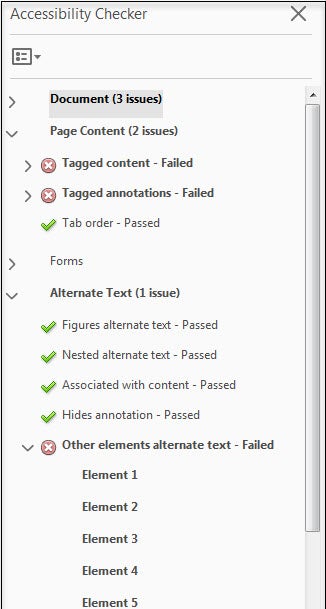
Run a full check on your document in order to see what errors/issues in Acrobat flags. The report helps you identify potential issues and provide tips on how to fix them. Accessibility Tool Pane then Full Check.
To assess the level of accessibility within information and communication technology content (e.g., documents, videos, etc.), conducting accessibility evaluations is crucial. Through accessibility evaluations, we can bring to light potential accessibility barriers that could affect individuals with disabilities and find methods to reserve these barriers. Conduct Adobe Acrobat Accessibility Evaluations.
Step 1: If this is your first time set up Adobe Acrobat software, select Tools Tab, Add Action Wizard and Accessibility
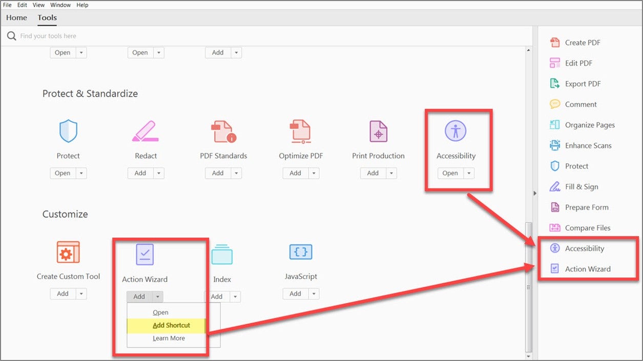
Step 2: Run the Accessibility Full Check

Step 3: Start Checking

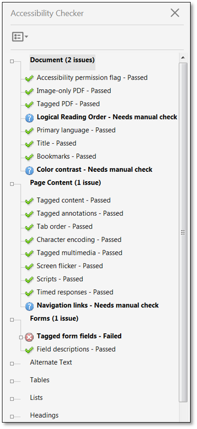
Step 4: Accessibility Check Results.
The checker will identify any accessibility passes, failure and it will also remind you to conduct manual or visual checks on items too. (E.g. check color contrast).
If you have a failure, you can right click on the item and you can get Adobe to fix your error or you can go to the link that will take you to adobe website that further explains the problem.
Save As PDF
What is Document Title?
A document title is a descriptive and meaningful version of the file name. When converting to PDF, titles are often visible in the PDF window or tab. Well defined PDF titles can help students assess the content of a document. This quick assessment helps students save time deciding which documents to engage with. The best way to add a PDF title is to edit an original document such as Microsoft Office file.
Windows
- Open Microsoft Word
- Select File from the menu and select Info tab
- In the Properties section, select Add a Title field to add a document title.
- A title is a short descriptive sentence of what the document is about. For example, file name ‘Accessible Tables.doc’ versus the title ‘Guide for Creating Accessible Tables’.
- Save the changes you made.

Mac
- Open Microsoft Word
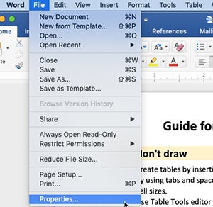
- Select File from the menu and select Properties
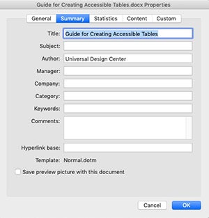
- In the Summary tab, enter Title field to add a document title.
- A title is a short descriptive sentence of what the document is about. For example, ‘Accessible Tables.doc’ versus the title ‘Guide for Creating Accessible Tables’.
- Save the changes you made.
Converting a document to PDF
Windows
- Select File from the menu and select Save As. Choose where you want to save the file.
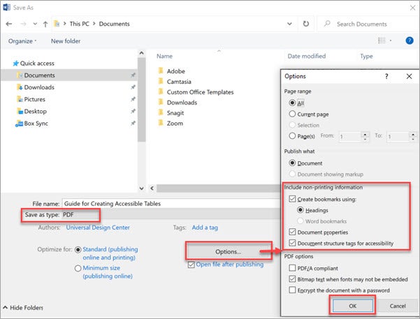
- In the Save As dialog box, choose PDF in the Save as type list.
- Select Options button in the same dialog box, make sure to select these boxes
- Document structure tags for accessibility
- Document Properties
- Create bookmarks using: Headings
- Select OK and Save the PDF.
Mac
- Select File from the menu and select Save As. Choose where you want to save the file.
- In the Save As dialog box, choose PDF (Export Formats) in the File Format.

- Select 1st radio button “Best for electronic distribution and accessibility (Uses Microsoft online service)"

- Select Export button
Never Choose Print to PDF Option
Never choose a "Print" to PDF option in Office, or in any other program. A screen reader user may still be able to access the text of a PDF created in this way, but heading structure, alternative text, a logical reading order, and any other tag structure will be lost.
Use Save As choose PDF.

Canvas Accessibility Checker
The learning management system, Canvas, has a feature embedded to check for accessibility. This feature checks accessibility in tables, headings, alternative text, color contrast and links.
Canvas for Ally
Ally is a service that focuses on making digital course content more accessible. It provides guidance to faculty on how to improve the accessibility of their content, and automatically provides students with more accessible alternative formats.
- Learn more about Canvas Ally
Canvas Ally

Ally is a service that focuses on making digital course content more accessible. It provides guidance to faculty on how to improve the accessibility of their content, and automatically provides students with more accessible alternative formats.
Learn more about Canvas Ally
Adobe Creative Cloud

Adobe Creative Cloud software is now available for use (at no additional charge) on all faculty and staff university-owned computers, labs and classroom devices, and for all students. Please note that this deployment of Adobe software is not available for use on personally-owned faculty and staff devices at this time.
All faculty and staff university-owned computers will continue to receive Acrobat Pro automatically. Faculty and staff who recently purchased Adobe Creative Cloud products should contact the IT Help Center, instead of following the self-service instructions. Visit the Adobe Creative Cloud for Faculty & Staff page for more information.
CSUN IT Software
Captioning
Captions allow people who do not have access to sound to engage with video and audio content. Captioning videos help students who are deaf or hard-of-hearing participate in classwork involving videos. Captioning is part of the Accessible Technology Initiative because videos have become an integral way to share information with students, faculty, staff, and visitors.
- Learn more about CSUN Captioning
- How to add Social Media Videos Captioning?
To assess the level of accessibility within information and communication technology content (e.g., documents, videos, etc.), conducting accessibility evaluations is crucial. Through accessibility evaluations, we can bring to light potential accessibility barriers that could affect individuals with disabilities and find methods to reserve these barriers. Multimedia Accessibility Evaluations.
Screen Readers
Screen readers are a form of assistive technology (AT) software that enables access to a computer, and all the things a computer does, by attempting to identify and interpret what is being displayed on the computer screen using text-to-speech. Screen readers can only access and process live text (fully editable or selectable text).
Normally used by someone who is visually impaired.
Who uses Assistive Technology?
Someone who is visually impaired, has a mobility limitation or has a learning disability


Benefits of using a screen reader
- provides access to someone who does not have useful vision, mobility or has a learning disability to access text on the screen
- offers same level of independence and privacy as anyone else
Type of Screen Readers
- provides access to someone who does not have useful vision, mobility or has a learning disability to access text on the screen
- offers same level of independence and privacy as anyone else
| Screen Readers Icon | Screen Readers Description |
 | Screen reader program for Microsoft Windows that allows blind and visually impaired users to read the screen either with a text-to-speech output or by a refreshable Braille display. |
 | Screen reader program for Microsoft Windows that allows blind and visually impaired users to read the screen either with a text-to-speech output or by a refreshable Braille display. The NVDA screen reader can be downloaded free of charge by anyone. |
 | Provides auditory descriptions of each onscreen element using gestures, a keyboard, or a braille display. |
 | Adds spoken, audible, and vibration feedback to your device. |
| Screen magnifier for Microsoft Windows that allows you to see and hear everything on the computer. |
How Do Screen Readers Work?
- Screen readers read line-by-line from left-to-right and top-to-bottom.
- Screen readers start at the top of a document or website and read any text including alternative text for images, graphics or charts).
- Screen readers navigate a document or website using the keyboard without a mouse. Tab key: jump from link to link, Enter: select a link, arrow keys: navigate a document or website.
- Reading order is important for users with visual challenges. The users can become confused if the document (content, tables, images or charts) is poorly organized or out of order.

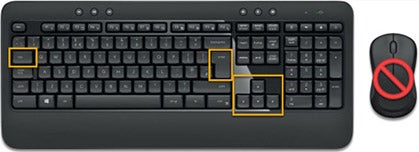
Click vs Select
Screen readers and physical or mobility limitation users navigate a document or website using the keyboard without a mouse. The word “Click” is not inclusive of people who can’t use the mouse. Use the word “Select” to write step-by-step instructions.
“Click” or “Click on” Example
- Go to YouTube video player
- Click on Settings gear icon
- Click on Subtitles/CC
- Click on Options to Customize
- Click on Caption Style
Use “Select” Example (Recommend)
- Go to YouTube video player
- Select Settings gear icon
- Select Subtitles/CC
- Select Options to Customize
- Select Caption Style
| Tool | Type | Open Source or Commercial? | Description | Link to download/access |
ChromeVox | Browser Extension | Open Source | The ChromeVox is a screen reader extension to Chrome that brings the speed, versatility, and security of Chrome to visually impaired users. | |
Browser Extension | Open Source | The FireVox is a screen reader extension for Firefox that brings the speed, versatility, and security of Firefox to visually impaired users. | ||
Standalone Application | Commercial | JAWS by Freedom Scientific is the most popular screen reader software that provides speech and braille output to allow users with low vision from accessing content on a PC. This application is a paid software but a free trial version is available that allows users access to a 30-minute demo mode. | ||
Standalone application and Online Application | Open Source | Text to speech program that will read text out load with natural sounding voices. This product is available as a free online web application and a stand alone downloadable application. A paid version is also available that provides additional services and features. | ||
Standalone Application | Open Source | Free screen reader that allows users with no vision to access content on PC. It reads text and information on a screen in a "computerized voice" and can convert text into braille. | ||
TalkBack (Android) | Software | Open Source and Commercial | Talkback is a screen reader for Android devices. This software provides audio and vibration feedback. The Select to Speak feature can read or describe a highlighted item. VoiceOver has image recongition that can describe an image and read text within an image. The Switch Access feature allows people to navigate the device with a switch. | Getting Started with TalkBack |
| VoiceOver (Apple) | Software | Open Source | VoiceOver is a screen reading software for Apple devices. It gives people auditory descriptions of the content that appears on screen. Gestures can be customized and be used as screen reader shortcuts. Voiceover also supports braille keyboard. | Getting Started with VoiceOver |
Assistive Technology
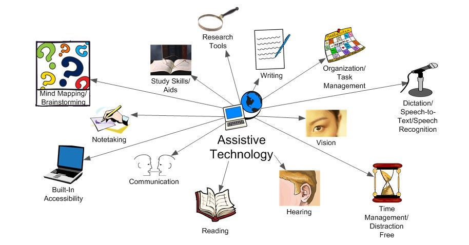
Image courtesy of Augsburg University
What is Assistive Technology?
Any item, piece of equipment, or product system, whether acquired commercially off the shelf, modified, or customized, that is used to increase, maintain, or improve functional capabilities of individuals with disabilities. Assistive Technology Act of 1998, as amended


