
This webpage is a guide to help survey creators develop an accessible survey through Qualtrics. For more information on developing accessible content through Qualtrics, refer to the Qualtrics Check Survey Accessibility page.
Accessibility Information
The Qualtrics survey platform has been reviewed extensively for accessibility and has known accessibility barriers that can impact a user’s ability to respond to a survey. The known issues include:
- Inaccessible question types
- Keyboard navigation and screen reader difficulties
- Form Accessibility Issues
It is the responsibility of the Survey Creator to ensure a survey developed through Qualtrics is accessible. Failure to make an accessible survey can impact survey response and prevent individuals with certain disabilities from responding. Before distributing a survey, it must be reviewed for accessibility.
Accessibility Best Practices for Qualtrics
Always add a Custom Survey Title
An accessible survey always REQUIRES a custom survey title. In Qualtrics, you can customize your survey title by going to the ‘Survey Options’ menu. Visit Qualtrics: Renaming Your Survey for a step by step tutorial.

Use the Accessible Question Types ONLY
Qualtrics has a list of accessible and inaccessible question types. ALWAYS make sure to use the accessible question types to reach the greatest amount of audience. Using inaccessible question types will impact your survey response as these question types will prevent people with disabilities from responding.
For more information go to Qualtrics: Question Type Accessibility. A list of Accessible and inaccessible question types is below.
Accessible:
- Descriptive Text
- Multiple Choice (all types)
- Net Promoter® Score
- Matrix (only Rank Order, Constant Sum, Text Entry, and Profile)
- Text Entry (all types)
- Rank Order (only Text Box, Graphic, and Radio Buttons)
- Side by Side
- Constant Sum (only Choices, a.k.a text entry)
- Drill Down
- Timing
- Meta Info
- Captcha Verification (V2)
Not Accessible*:
- Rank Order (Drag and Drop and Select Box)
- Matrix
- Constant Sum (Sliders and Bars)
- Pick Group and Rank
- Hot Spot
- Heat Map
- Graphic Slider
- Signature
- Highlight
- File Upload
- Org hierarchy (EX)
*Workarounds for inaccessible question types
The University of Colorado Boulder has a webpage dedicated to Qualtrics accessibility that includes a list of workarounds for inaccessible question types. Some of the workarounds are listed below:
Visit University of Colorado Boulder’s Qualtrics Accessibility Page for more workarounds.
Number your Survey Questions
Best practice is to always number your survey questions to make it easier for respondents to know their progress. Use Qualtrics: Auto-Number Feature to number your questions.
Add alt text to all your images
If an image is part of a survey question or answer it MUST have Alt text. Below are resources for adding alt text to an image in Qualtrics.
- Qualtrics: Image Properties
- University of Colorado Boulder: Qualtrics- Adding Alt Text to a Graphic
- CSU San Marcos: Qualtrics- Adding Alt Text to a Graphic
Alt Text for Logos
If a logo is present in a survey, the logo needs alt text as well. However, in Qualtrics, there is no direct way to add alt text to a logo. However, a method to add alt text to a logo is available in the Qualtrics Community Board (Accessibility - Adding Alt-Text to a Dynamic Theme). To add alt text to a logo:
- Go to the "Look and Feel" menu
- Select the General tab
- Add the JavaScript code shown below in either the "header" or the "footer" field
<script>
document .querySelector('#Logo > img') .alt= " LOGO ALT TEXT GOES HERE "
</script>
Add Headers to your Survey
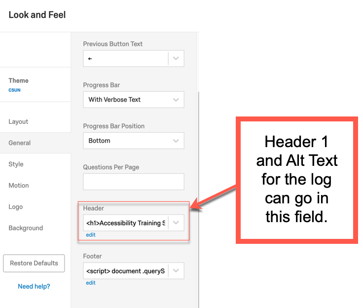
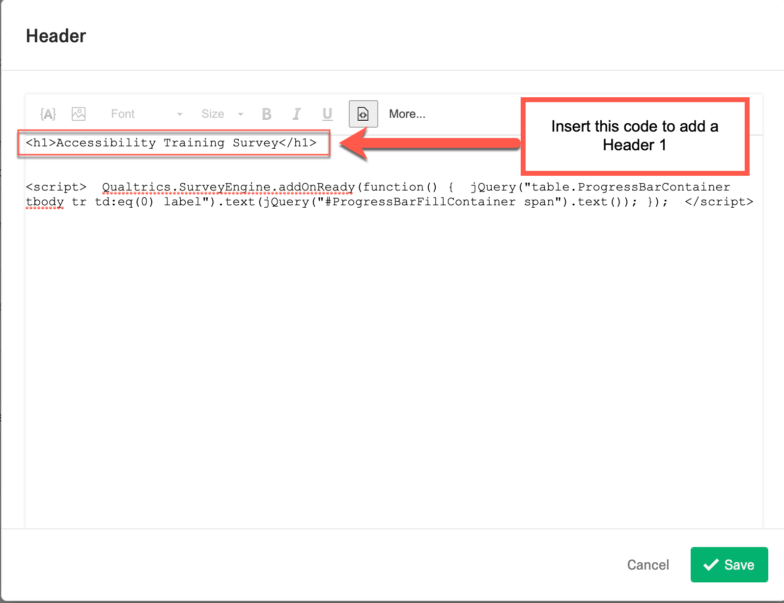
Headers must always be part of your survey to provide structure and organization to your content. A survey MUST ALWAYS have a Header 1 (<h1>) and sub-headers can be included to further organize your survey.
How to Add A Header 1
- Go to the Look and Feel menu:
- Go to the ‘General’ tab
- Type the Header 1 under the section “Header”. The Header 1 must be typed in HTML format (<h1> Enter Header 1 here </h1>)\

Adding Additional Headers
You can add additional headers within the main survey content by going to the HTML View in your questions. Additional headers must also be typed in HTML format.

Use High Contrast Mode
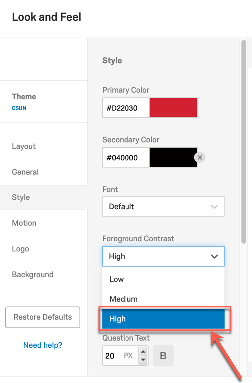
Always make sure there is enough color contrast between the foreground and the background. Best practice is to use the high contrast mode in Qualtrics. The high contrast will make it easier for users to see the text in your survey. To enable high contrast mode:
- Go to the Look and Feel menu
- Open the “Style” Tab.
- Then go “Foreground Contrast” and open the dropdown and select the option “High” to enable high contrast mode.
Make the Text Large
The text in a survey must always be clearly visible. Best practice is to enable high contrast mode to make the text easy to see and also make sure the text size is greater than 18pt. To change the text size:
- Go to the Look and Feel menu
- Open the “Style” Tab.
- Change the Question and Answer Text
Recommendation: Question Text should be 20pt and Answer Text should be 18pt.
Add Text to Buttons
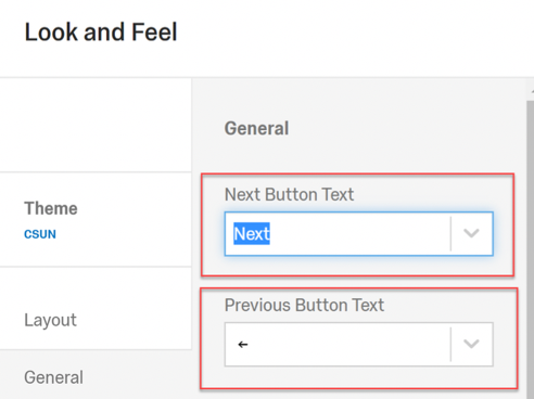
Instead of using the default arrows in Qualtrics, all buttons in a form must have clear text. Text makes it easier for all users to understand the intent of the button.
To add text to the button:
- Go to Look and Feel menu
- Go to “General” tab
- Type the button text in the “Next Button Text” and “Previous Button Text” Fields.
Submit Buttons
For surveys with multiple pages, the button on the last page must always indicate that the button will submit a survey. The Qualtrics Support page provides a step by step guide for Making a Submit Button.

Add Text and Numerical Progression to the Progress Bar
In Qualtrics, the progress bar has some limitations when it comes to accessibility. It does not have any text and does not show a numerical progression for a survey. This makes it difficult for non-sighted users and users who cannot understand visuals to understand the survey progress. To make a Qualtrics progress bar more inclusive, add a title and numerical progression to your progress bar.
How to Provide a Title to your Progress Bar
- Go to the Look and Feel menu
- Select General Tab
- Go to the drop-down titled “progress bar” and select the option “progress bar with verbose text”. This will provide a title to your progress bar.

How to Add Numerical Progression to a Progress Bar using custom JavaScript
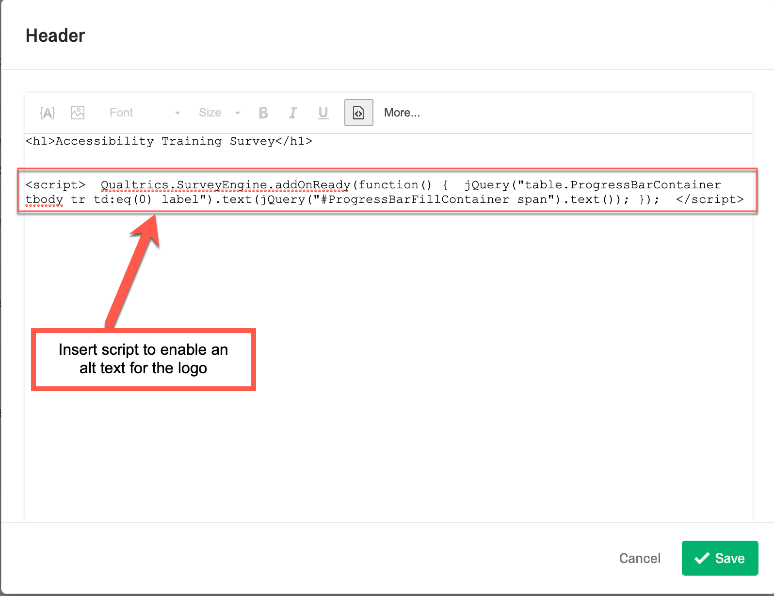
The Qualtrics community board provides methods to customize a progress bar have been provided including a method to add numerical progression using JavaScript. The example below is a script developed by the Qualtrics support community that will incorporate a percentage number to track survey progress. To add the script:
- Go to the Look and Feel menu
- Select the General tab
- Add the script shown below in either the “header” or the “footer” field.
<script>
Qualtrics.SurveyEngine.addOnReady(function() {
jQuery("table.ProgressBarContainer tbody tr td:eq(0) label").text(jQuery("#ProgressBarFillContainer span").text()); });
</script>
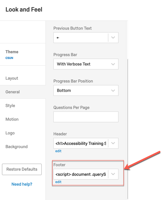

Incorporating this script will add a percentage number next to to the survey title. This will make it easier for all users to track the overall progress of the survey.

Do not Auto-Advance Questions!
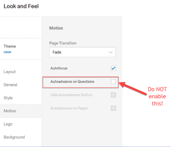
Qualtrics has an auto-advance questions option, however, enabling this feature results in accessibility barriers. Since this option automatically moves users to the next question when a selection is made, it prevents users from verifying and changing their selections. Therefore, for a smooth user experience, always make sure this option is disabled in a survey before distributing. To disable this option:
- Go to the Look and Feel menu
- Select the Motion Tab
- Uncheck the “Autoadvance on questions” checkbox.
Use the Qualtrics Accessibility Checker
Before publishing and distributing a survey, you MUST check for accessibility. Qualtrics has a built-in accessibility checker that will diagnose your survey based on select standards. However, the checker does not evaluate everything. It is important to ALWAYS manually and visually inspect your survey to make sure it is accessible.
Qualtrics Accessibility Checker
The Qualtrics Accessibility Checker can be used as a starting point the gauge the level of accessibility in a survey. The checker mainly looks for inaccessible questions and provides suggestions on how to make a survey more accessible. To use the checker:
- Go to the Tools menu
- Select Review
- Select “Check Survey Accessibility”
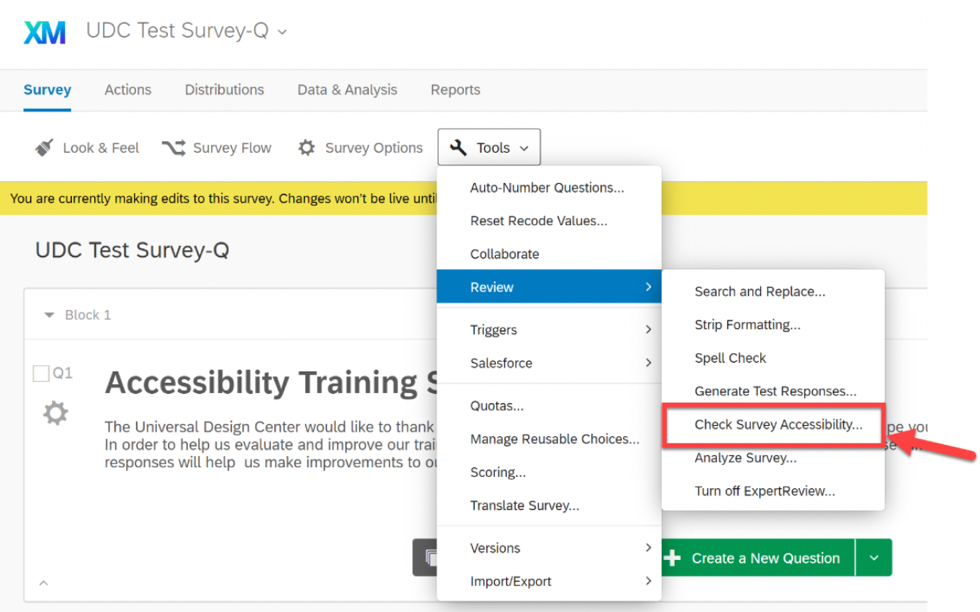
The checker will then provide a brief report on the accessibility of your survey and provide additional recommendations or suggestions. Please note that passing the Qualtrics Accessibility Checker DOES NOT mean your survey is fully accessible.

Always Conduct a Manual Accessibility Test before Distributing your Survey!
The Qualtrics accessibility checker DOES NOT test does not test the overall look and feel of your survey. As a result, manual and visual accessibility test must always be conducted to make sure the survey layout is accessible and that all the features enabled under the “Look and Feel” menu meet accessibility best practices and standards.
What to look for:
Check the layout: Always test your Survey Layout by conducting a Keyboard Accessibility check. In Qualtrics, some survey layouts may pose problems with a keyboard therefore, you must always test your survey to make sure it is accessible with a keyboard only. Problems with keyboard access are considered critical accessibility barriers as they will prevent some users from responding to your survey.
To conduct a keyboard accessibility check:
- Go to your survey preview
- Use the “Tab” key to navigate through your survey. If your survey has questions with radio buttons (e.g. single choice questions) use the “arrow” keys to navigate through those questions.
Are you:
- Able to navigate to all elements (e.g. form fields, buttons, links, etc.) in your survey using only the ‘Tab’ key (or Arrow key)?
- Can you make a selection in your survey using the “space” or “enter” keys?
- As you use the ‘Tab’ key can you see where your tab focus is located?
If you respond ‘no’ to these questions, then your survey may not be fully keyboard operable. You will need to change your survey layout until you find the most keyboard accessible layout.
Text Check: The text must be reviewed to make sure the text in the survey is easy to read and that all non-text elements (e.g buttons, images, etc..) have text associated. If the text is difficult ot read or not present, users with various visual impairments will not be able to fully comprehend the survey.
Review the colors used in the Survey: If the color displayed in a survey is difficult to see, there may be a problem with the color combinations used on the page. Review the foreground and background color of the survey and check that all information remains comprehensive.
For additional accessibility testing tips and tools, go to UDC’s Evaluations Page.
Survey Questions and Language
Question Types
- Avoid using question types that may not be accessible for survey takers with disabilities.
- Always make sure questions with input fields are resizable.
- Avoid using videos and images as part of a question. These questions may not be inclusive for survey takers with sight disabilities. Videos may also cause problems for survey takers who are deaf or hard of hearing if the video is missing captions.
- To ensure users with visual disabilities have full understanding of a grid question, a table summary is required.
- If a question is required, always make sure the required question has an asterisk next to it. Do not use color only to differentiate required questions from other question types.
Language
- Always provide instructions to questions to ensure users with disabilities will fully understand how to navigate the survey or question.
- Provide clear and descriptive error messages for survey takers to receive when they input incorrect data. The error message should clearly describe the error and explain how to fix it.
- Always be mindful of the language in your survey. Avoid using text that can be difficult to understand or can be taken out of context. For more guidance, visit UDC’s Readability Page.
Design and Heading Structure
Structure
- Always add headings to your survey as they help organize information and allow survey takers using screen reader technology to better navigate a survey.
- Headers must always be part of your survey to provide structure and organization to your content. A survey MUST ALWAYS have a Header 1 (<h1>) and sub-headers can be included to further organize your survey.
- Do not skip heading levels. Proper header levels ascend from H1-H6.
- Headings should not be used to emphasize the importance of content instead, use underline or bold text.
- When emphasizing text, use the appropriate program features to bold, underline or italicize text instead of capitalizing text. Cap’s text is not understood by screen reader technology and this can prevent survey takers with disabilities from understanding important information.
- A page description is always needed to describe the purpose of the survey. Visit Universal Design Center: Semantic Requirements for more information.
Color
- Do not use color only to emphasize content
- Always make sure there is sufficient color contrast between the foreground and background of your survey.
Layout
- Use the recommended accessible layouts and themes in any survey creating tool.
- If a survey is long, it is recommended to break the survey into multiple pages and enable question and page numbering to let users know the length of the survey.
- Do not use the One-At-A-Time survey interaction feature as it interferes with screen reader technology’s ability to interpret information.
Time Limits
If time limits are present in a survey, a method to extend time limit should be present.
- It is recommended to provide a visual countdown or display to let survey takers know how much time remains.
- Survey takers must be warned beforehand if a survey has a time limit.
Mobile View
- Make sure survey questions and input fields are resizable.
- For better mobile layout, always organize multiple choice questions in a vertical layout.
- Avoid using JavaScript-based questions as they may not be accessible on mobile devices.
Alternative Solutions
Departments must also have a method to let survey-takers know if alternative solutions are available. It is highly recommended to provide a statement near the top of the survey that let as a survey taker know who to contact for assistance and provide links to resources to help them.
Example:
If you are having problems completing this form due to accessibility-related issues, contact (Department/survey creator contact information).
In addition, departments must establish alternative solutions to use if survey-takers have problems completing a survey due to accessibility barriers.
Examples of alternative solutions for a survey include:
- RSVP Surveys: Provide a survey-taker another method to RSVP instead of a survey. For example, allow a survey-taker to call or email the department as an alternative. If a survey is used to RSVP to an event, allowing users to RSVP via phone or email would be an effective alternative.
- Research & Climate Surveys: An alternative survey format can be made available to survey-takers who need it. Alternative formats could be a paper survey, PDF or other accessible electronic documents.
- Classroom Polls: If a survey is used for classroom polls or instruction, an alternative method to participate in class assignments should be considered such as an alternative device or program a survey taker can use instead.


