Introduction
The purpose of each link should be determined from the link text alone or from the link text together with its programmatically determined link context. A mechanism is available to allow the purpose of each link to be identified from link text alone, except where the purpose of the link would be ambiguous to users in general.
- Link Description: Link text must always properly describe the purpose of the link and tell a user exactly where the link will take them. If a link is not descriptive enough, users may not use the link or may use the wrong link when attempting to find information. Links such as “click here” and “more information” and "read more" should not be used because they do not provide enough information about a link and when used out of context, may make it difficult for users to understand the link purpose.
- Unique link text: Each link on the page should be unique unless the links are leading to the same page.
Link Identification
Links should always be visually different from regular text on a website. Visual indicators will allow users to identify links more quickly. Links can be differentiated from other text using various combination of color, bold, underline or italics. However, color should never be the only means to differentiate a link from regular text. Use of color should be accompanied by either underline, italics or bold text (font styling) in order to differentiate link from regular text.
Consistent Navigation
Navigational mechanisms that are repeated on multiple Web pages within a set of Web pages occur in the same relative order each time they are repeated, unless a change is initiated by the user. Links such as breadcrumb links are important when it comes to consistent navigation. Breadcrumbs are visual trail of links that allow users to identify their location on a website. They allow users to see what steps they took to reach a page and provide the ability to go back to pages without using a "back button". Breadcrumbs are particularly useful for websites with complex structure or web pages in a sequence.
Link Functionality
Link functionality is about ensuring a link functions the way it is expected to. When it comes to accessibility, a link must perform an action that is stated in the website or link text. If a link does not perform an action properly, users may get frustrated with the functionality of the website. In addition, opening new windows and tabs could disorient users, especially people with cognitive disabilities or have difficulty perceiving visual content. However; in some specific situations it is necessary to open a new window or tab from an accessibility perspective. A link must always function in a way that will enhance the accessibility of a webpage.
Plug-ins/ Document Readers
Plug-ins/ Document Readers are links to software downloads that users need to view web content. Web pages often have additional documentation or videos to provide visitors in distinct formats such as PDF, Word, Excel, Flash, etc.. This can be a problem for not all users share the same programs or software and therefore some users may not have the different document formats installed on their computer. As a result, when web pages have links to documents in different formats, there must be a link to download a plug-in or document reader. Providing a download link to the document viewers will ensure a user has the ability to acquire the correct software to open and access the information in the document.
Best Practice
Link Identification & Consistent Navigation
- Link text must always clearly represent the link purpose as well as its destination
- Do not use non-informative link phrases such as click here, here, more, read more, info, etc.
- Do not use the same link text on links that go to different sources
- Do not use different link text on links that go to the same resource.
- Links should always visually stand out and be easy to identify as links
- Links should stand out by a combination of color and underline.
- Color should not be the only method to distinguish links.
- Underlines should be reserved for links only. Using an underline for emphasis may confuse the user when navigating the website.
- If a :hover or :focus element is implemented, the hover color must be within the color contrast standards
- Provide no more than 7 main global navigation links so users can easily see where they wish to navigate to without confusion.
Functionality and Document Readers
- Links that open in new window/tab may cause confusion and difficulty for some users including screen reader users. Avoid opening links in a new window/tab unless it is absolutely necessary (e.g. for security or authentication purposes or third party transactions). Inform user in advance that the link will open in a new tab/window. This will allow the user to decide if they want to leave the current window.
- Examples:
- Always provide a link to download document readers and/or plugins
- When linking to a document, users should be made aware of the type of format of the document.
- Include the type of document format within the link text in parenthesis. For example, the link text for a PDF document should be "UDC Best Practices (PDF)".
Examples
Link Description
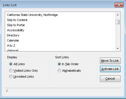
Assistive technology users are able to retrieve a list of link text on the page. The screenshot below displays such list on the page. It is important to have comprehensive and descriptive link text so assistive technology users can understand the intent of the link. If the link text was “Read More” or “Click here”, users would not have any context to where the links will take them.

Same Link Text
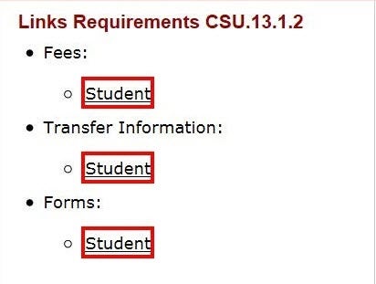
If multiple link text direct users to different pages, each link should be unique. The screen shot below is an example of same link text that direct users to different resources. All the links have a link text of "student" but each link will direct users to a different page related to student information.

Link Identification
The statements below demonstrate how link appearance significantly enhances the readability and display of the links. The first statement conveys links that do not display any visual indication that they are links. As a result, visual users will not know that there are links within the statement. Moreover, when color is only used to differentiate links, users with visual impairments will only see the links without color, thus preventing them from knowing links are on the page. The second statement, however, uses a combination of color, underline and bold to differentiate links from regular text. This will make it easier for all users to know links are present in the statement.
Statement 1
The Universal Design Center website provides the campus community information about Accessibility and Universal Design Perspectives, Universal Design Principles, and the Accessible Technology Initiative (ATI). The Web Accessibility page is dedicated to providing training information about making an accessible web.
Statement 2
The Universal Design Center website provides the campus community information about Accessibility and Universal Design Perspectives, Universal Design Principles, and the Accessible Technology Initiative (ATI). The Web Accessibility page is dedicated to providing training information about making an accessible web.
Global Navigation Menu
The screenshot below is an example of global navigation links at the top of the page. The global links should always be located at the forefront of the page and should be limited to 7 global links total. This will ensure users are not overwhelmed with too many links at the beginning of the page.

Consistent Navigation
The example below a set of breadcrumb links. The breadcrumb is a visual representation how many levels deep a user is within a website. The user will also be able to see a list of the pages they have accessed. Providing such consistency on all related pages will streamline the navigation process.
Document/Reader Plug-ins
The screen shot below demonstrates a link to download Adobe Reader at the footer of a page. Users who are unable to access or view PDF files can simply download the required reader software using the link provided.

Testing Methods
How to evaluate a page for meaningful link text?
- Review all the links in the page
- Make sure that the following phrases are not used as link text: Click Here, Read More, More, More information. Or any similar text that does not provide enough information about the target page.
- Review the link text to make sure it is descriptive enough to understand where it will lead.
- Verify whether link text are unique otherwise they refer to the same page.
- Check the link to see if it leads to an active page.
WebAIM WAVE Toolbar
- Activate the WAVE toolbar and review the “Details” tab in the left panel.
- Look for any errors or alerts related to link text, such as suspicious link text, or redundant link text.
Examples of link related issues that will be tagged with the following icons:
![]()
![]()
Identifying Link Text
Visually inspect links to ensure that every link has proper visual indicators (bold, italics, underline, and/or color).
Consistent Navigation
It refers to providing consistent structure and presentation for users who repeatedly interact with a series of web pages and need to efficiently find specific content or functionality every time they visit a page. Individuals with visual impairment who use screen magnification for a small section of the screen use visual identification and location of the content quickly find repeated content.
Steps to review a breadcrumb:
- Navigate to a Web page.
- Check that a breadcrumb or any major navigational panel or group of global navigation links.
- Verify whether they provide consistent and valid navigational sequence to direct users to proper pages.
For a breadcrumb trail that does not include the current location:
- Check that all elements in the breadcrumb trail are implemented as links.
For a breadcrumb trail that does include the current location:
- Check that all elements except for the current location are implemented as links.
- Check that the current location is not implemented as a link.
- Check that all links navigate to the correct Web page as specified by the breadcrumb trail.
Link Functionality
- Each link is associated with a specific functionality that is expected to be triggered once activated. They should function as expected.
- Visually and manually check for their functionality. Some of the functionality test can be done through automated testing tools.
Document readers
- Review the page for documents in different formats
- Verify that the link informs a user it is in a different format
- Verify that a a link to download a document reader is present.
TIP: Use automated testing tools to identify links to different file formats.
WebAIM WAVE Toolbar
Link to documents are tagged with the following icons:
![]()
![]()
