Do you think your area could use a directory makeover? Our Building Directories checklist of good practices can help you get started!
Need some inspiration? We like these examples:
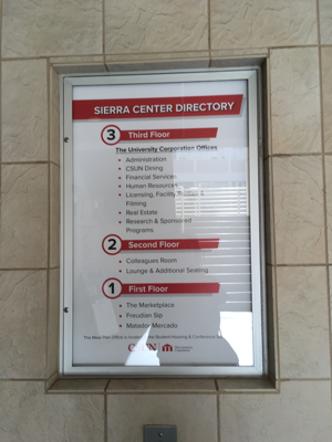
Two sample directories and why we like each one  | Sierra Center is a three-story building with a relatively simple layout. The building directory makes it easy to find your way, and it's helpfully located by the building elevators and stairs. Another nice feature: it displays the floors top to bottom (floor 3 on top, floor 1 at the bottom)--which reflects their relative locations for pedestrians. |
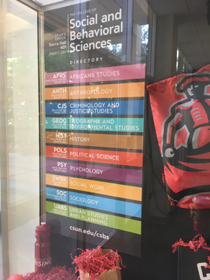
 | The College of Social & Behavioral Sciences (CSBS) uses bright colors to draw attention to their A-Z list of academic departments. The departments occupy multiple buildings, which makes mapping their locations impractical. Providing building and room numbers for each department office along with a link to the CSBS website helps with way-finding. |
Are students easily able to find your office to conduct their important business and get the advice they need? Find out with our checklist!
Do your online and building directories: | YES | NO |
ü Give clear and detailed phone number and location information? | | |
ü Give detailed locations for the sub-areas students often look for to conduct their business? (Cash Services, Advisement, Interlibrary Loan, etc.) | | |
ü List by name the people in each area who students interact with most and where to find them? | | |
ü Provide an area map with “You Are Here” to help students navigate? | | |
ü List the office hours? | | |
ü Bonus: Have you tried to find your office using the CSUN online map? 1. Does the map lead students to the right place? 2. Does it give the most direct route? If you answered “no,” consider working with IT to correct the information. | | |
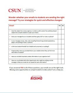
 Wondering how to write effective student emails that prompt students to take action?
Our Email Messages checklist of best email practices can help.
You might also want to read this brief article from Faculty Focus: The Art & Science of Quality Course Announcements: How to Avoid the Trap of the Info Dump. Karen Costa. 1 Feb 2019; orig. published 26 Feb 2016. The article offers some common-sense tips on when to send email and course reminders to your students—and what to say.
If you're telling students they've won a contest, prize, or scholarship, you probably won't need much help from us.
But if the letter delivers bad news, you'll need to give some thought to how you can state the facts without making things even worse for the recipient.
Here's a pair of letters sent to undergraduate students to let them know they're on academic probation. Both letters convey the same unfortunate fact--but the doomsday tone in the version "before" revision is replaced in the version "after" revision with a series of suggestions about what the student can do next, including ways to return to good academic standing.
- Before revision in 2015, the letter opened with a stark announcement of failure, a second paragraph invoking an ominous Executive Order, followed by a table defining disqualification in terms of GPA, the threat of what will happen if the student is actually disqualified, a final meaty paragraph about how "serious" this is and the possible "consequences, and finally a closing reminder about the need to take the news about probation "very seriously." The tone overall is "Abandon all hope, ye who enter here."
- After revision, the 2019 letter was revised to provide constructive advice and assistance, with a focus on "information," "opportunity," the "wealth of resources" available on campus, and the comforting idea that "Students find themselves on probation for many reasons." The rest of the letter offers various resources so students can get help, and closes with the hopeful promise that "By seeking out campus resources early, including academic advising, you are more likely to return to good academic standing with minimal disruption to your educational goals." The emphasis is on probation as an unfortunate but probably temporary academic state, with every possibility for a different and better future.
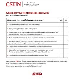
 You know the old saying, "You only get one chance to make a first impression." Does your front desk/reception area send the message that you are willing and able to help? If your first impression could use a makeover, see our Front Desk checklist for suggestions.
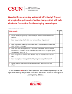
 We know that it can be difficult for students to reach out for help. A voicemail message that is warm and personal, not mechanical, can help students to feel confident that someone who cares is ready and willing to help, even though they are not available in that moment.
If you think your area or department could use a voicemail makeover, our voicemail checklist and sample greetings can help you get started.
 Love your CSUN webpage? Test it with our checklist!
Our webpage checklist can help you to imagine ways of making your web page more inviting, informative, and user-friendly. We like these great CSUN examples that might inspire your webpage makeover.
- The ZER0 WASTE home page stands out for the clarity of its call to action. Users are invited to "take the Zero Waste Challenge" and "Help Us Reach Our Goal of Zero Waste" by filling out a simple web form. Other content is readily visible in the red global nav bar menu at the top of the page. No muss, no fuss, no clutter.
Do you know of a great CSUN webpage that you'd like us to highlight here? Let us know!


