by Charles Hatfield
September 27, 2016

Black Widow No. 6 (Oct. 2016), cover by Chris Samnee and Matthew Wilson. © Marvel.
Last week I bought and read the latest issue, #6, in Marvel's Black Widow, a monthly superhero comic book created by the team of writer/artist Chris Samnee, co-writer Mark Waid, colorist Matthew Wilson, and letterer Joe Caramagna. This series follows the former Soviet spy and assassin The Black Widow—the proverbial hero with a shady past—and what happens to her when she is blackmailed into doing bad things. It's a breathless, cinematic thrill ride of a comic, in tune with the Marvel movies, and boosted considerably by Samnee's crisp and artful storytelling. I don't ordinarily buy comics like these in their monthly installments, preferring to wait for bigger collections rather than collect fragile "floppies" at four bucks a pop ($3.99 usually nets you just 20 pages of story). But Black Widow, well, it has me pretty much hooked.
My reasons for digging it are mainly formalist and aesthetic ones: I'm obsessed as much with how the story is told as with any themes or character revelations it contains. That's me—I like studying comic book pages. I've been staring at one page—the very first page—from Black Widow #6 for several days now, and thought I would share some observations about it. My aim is to show some of what I appreciate about comic book storytelling.

Black Widow No. 6 (Oct. 2016), page 1, by Waid, Samnee, Wilson. and Caramagna. © Marvel.
The design and drawing (and in this case coloring and lettering) of a single comics page may involve hundreds or even thousands of artistic decisions. Some of these decisions will be almost spontaneous, that is, not thought over very much: decisions made by habit, or by learned instinct. On the other hand, some will involve hours and hours of tinkering, drafting and redoing, and agonizing over small details. Some decisions, of course, will be constrained or even dictated by commercial pressures, editorial fiat, house style, the requirements of genre or brand, or serial structure, and so on; superhero comics (and certainly monthly Marvel comics) follow a lot of unspoken rules or formulas. But even in a genre and tradition with very clear and narrow constraints, creators have a great many decisions to make per page. Readers too have many decisions to make—interpretive decisions—and naturally their decisions are informed by how familiar they are with the kind of comic they're reading. Some of what readers decide will be beyond what the creators could ever have envisioned, and may even be at odds with what the creators thought they were doing; that's what reading is all about. But experienced creators learn to anticipate their readers, and think about how to engage them. There again many decisions are involved: where to be clear, and where mysterious, how to withhold information, how and when to reveal it, and so on.
Naturally, the first time I read Black Widow #6, I didn’t stop to think long about the decision-making that went into it. Instead, I read it simply (if reading is ever simple) for the thrill of the story: navigating the plot, watching hints from previous issues pay off, and catching the story's rhythms and momentum. I read for the pleasure of "getting it," digging the buzz and kick of high-octane comics storytelling. Sure, I paid attention to what was happening on the page visually; even during that first reading, I was aware of the story's visual form, and dug the sheer panache of the delivery. But my initial run-through was mostly about trying to follow the twists in the plot: a breathless, hurtling story I've been following in serial form roughly every four to five weeks for the past six months, since Black Widow #1 last spring. It's been a crazy ride, by design. Every issue of the Widow has begun with mystery and suspense, that is, with scenes bound to provoke questions: scenes of surveillance or escape; a funeral; a flickering wake-up after being knocked out. Always the book starts in medias res, with a wicked narrative tease, and ends with a cliffhanger. That's why I, as a reader, am always primed to pick up a new issue of Black Widow for the thrill of story. This issue, #6, is no exception, though its first-page tease is fairly quiet and understated (which is one of the things that interests me about it).
To me, though, comics are never only about following plot, and they are made as much for re-reading as they are for reading. What I'm about to share with you I got from re-reading, which I did not so much for serious study but simply for fun, as I very often do with comics. Here's some of what re-reading revealed to me about this page:
THE SETUP
First, a brief summary may be in order: Plot-wise, Black Widow #6 involves the intertwining of various strands in the Marvel Universe. Specifically, our heroine Natasha, the Widow, is about to mix it up with Tony Stark, i.e. Iron Man. This seems fitting, since the Widow was first introduced as an Iron Man villain back in 1964 (Marvel has a number of reformed villains now serving as heroes). In the previous issue of Black Widow, #5, Natasha was revealed to be responsible for the kidnapping of Prof. Yinsen, the scientist who built Stark's first Iron Man suit and basically gave his life to save Stark. When this news leaks out, Stark realizes that Natasha, his long-time ally and sometime antagonist, was behind the very chain of events that led to his becoming Iron Man—and to Yinsen’s death. Tony is pissed, as the end of issue 5 hints:

Black Widow No. 5 (Sept. 2016), page 20, by Waid, Samnee, Wilson. and Caramagna. © Marvel.
(This, by the way, represents a major rewriting of Iron Man's origin story, from back in 1963. In fan parlance, getting Natasha tangled up in that story is a retcon, i.e. a case of retroactive continuity: essentially a revision of a previously-told story that casts events in a new light or reveals a new wrinkle. A very useful technique for finding new ways to spin old characters.)
So that's the setup: two Marvel heroes are primed for conflict, in an atmosphere of moral ambiguity, secretiveness, and mistrust. The story mixes conventions from the superhero genre and the espionage thriller (if you've seen Captain America: The Winter Soldier, you probably have a good idea of this mix). Further, the style nods to film noir, and the palette fittingly mixes shocking reds (the red of Natasha's hair, but also of the sinister "Red Room" where she was trained to kill) with black, grays, and steel-blues. In short, Black Widow is the superhero comic as spy story: paranoid, insinuating, and darkly stylish. (This sort of mashup happens in superhero comics all the time; the genre is a magnet that draws other genres to it.)
All this is prologue to what interests me.
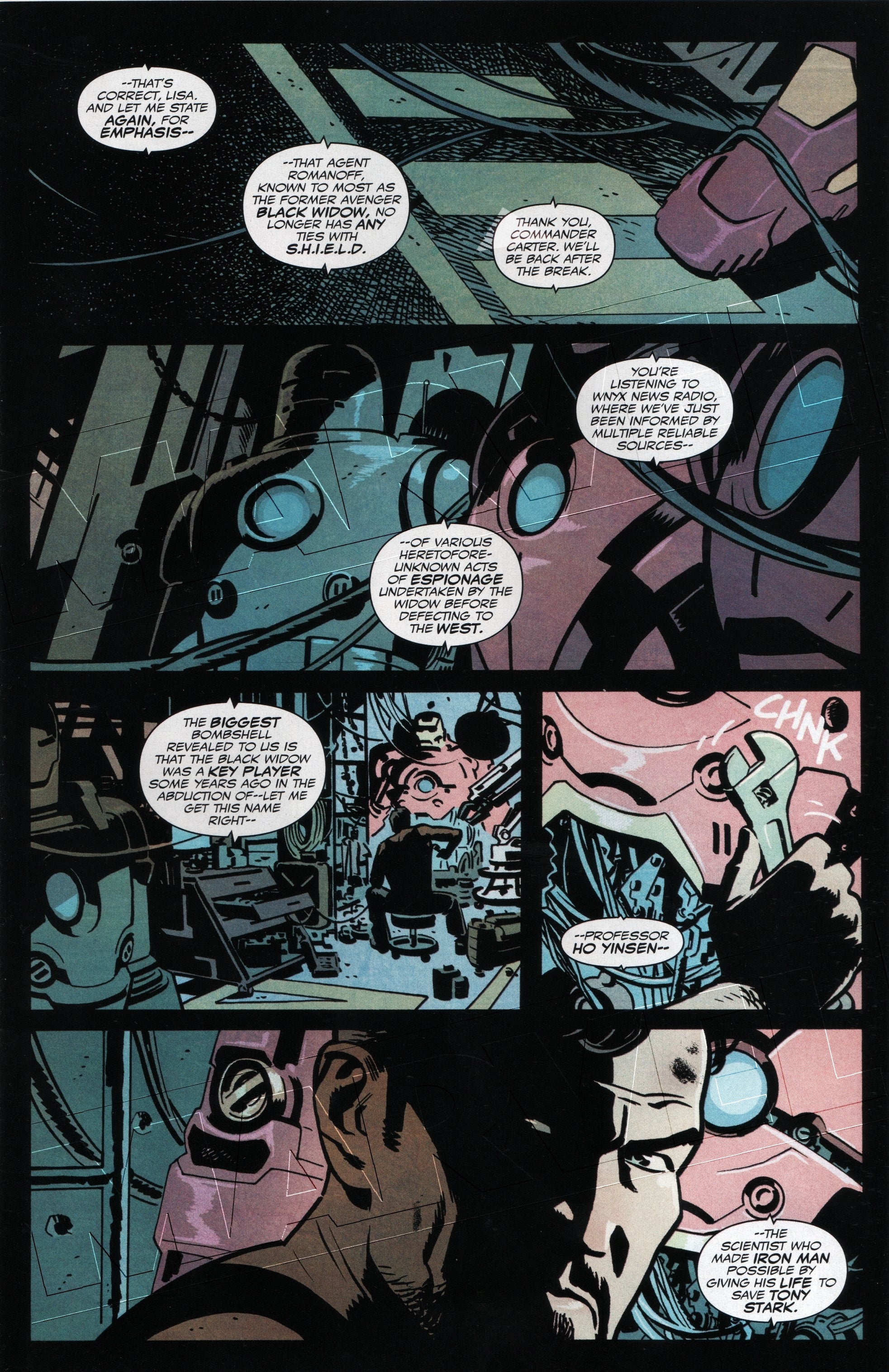
Black Widow No. 6 (Oct. 2016), page 1, by Waid, Samnee, Wilson. and Caramagna. © Marvel.
LAYOUT
One of the first things I tend to notice about comic book pages (on re-reading) is the architecting of the page, that is, the layout. This means the graphic design of the page, particularly the shaping and positioning of the big elements or building blocks that make up the page. In comic books and graphic novels, the most obvious elements, i.e. the ones that stand out as containing other elements, are the panels—in this case, five rectangular panels. These five panels are arranged in four tiers of roughly equal height, so that the page consists of four bands or strips, stacked in a column: a very common layout in Black Widow, and indeed in many comic books. Layout-wise, then, this page is not unusual or ostentatious; it's not showing off (unlike some of the other pages in this series!). Since the panels are all discrete and self-contained, with clear borders or frames around them, and no overlapping, the page comes across to me as a very classical, almost self-effacing one. Distributing the five panels over four even tiers means that one of these tiers will have two side-by-side panels, while the other tiers will each consist of just one wide panel (an observation we’ll come back to in a moment).
Black Widow often uses black gutters; i.e., the spaces between the panels are printed pitch-black, the better to convey uncertainty and paranoia and get that noir-ish look. The black gutters typically surround the entire page, acting as margins as well as mortar between the panels. Looking at this page again, I’m struck by how those dark gutters seem to join the panels together, reminding me to think about the whole page, not just the pieces. In this light, you could say that the five panels here are bounded by another, still larger panel: an implied panel enclosing the entire page that we can call (after scholar Thierry Groensteen) the hyperframe. Basically, the hyperframe surrounds the entire image area of the page—everything within the margins. This hyperframe is a condition so basic and unobtrusive that readers don't usually reflect on it, except in those cases where the hyperframe is broken and an image leaks out beyond the margins, that is beyond the "safe zone" of the frame, going all the way to the trim line, i.e. to the cut edge of the paper. Such images are called bleeds, as they "bleed" off into space. Black Widow #6 has five bleeds in it, all signaling moments of great intensity or suspense. However, there is no bleed here on the first page, which, again, appears very classical and contained. It has to be, I think, in order to work narratively.
In US comic books and graphic novels, panels most often are bordered; see how clearly and thickly the black gutters do the work of bordering here. And panels typically fill the entire hyperframe, top to bottom, left to right. Exceptions would be moments where images are surrounded and isolated by large areas of blank or “negative” space (which can have a very dramatic effect). In this case, as on most pages in this issue, the hyperframe is filled but not overfilled, and the black bordering will remind regular Black Widow readers of the series' prevailing style and mood. In this setup, I note, again, that three out of the four tiers consist of single, page-wide panels. The exception here is the third tier of the page, which is the one composed of two panels, one a bit wider than the other. The effect here, for me, is that the third tier conveys a sense of relative quickness, or a sudden response.
NARRATIVE ELLIPSIS
How do we readers navigate from panel to panel? How do we make continuity out of discontinuity? And how do the creators seek to anticipate and guide our reading?
What I see here is closely comparable to film storytelling. It looks as if Black Widow is one of those comics (there are many) that aspires to be like a movie on paper. Not all comics do, of course—and not all good comics do. But Black Widow does. Samnee's control of the flow of images, and the work Samnee and colorist Wilson do together to build atmosphere, remind me very much of moviemaking. Thinking as film editors, we might observe that the scene begins a bit confusingly from the "inside out," meaning that it gives no "establishing shot" at first. Remember, this is the very first scene in the comic, therefore a place where we might expect the storytellers to take the reader by the hand and try to orient them without any ambiguity. But I don’t think that’s what happens here. This page does not orient us with a first panel that shows the entire setting, but instead isolates small details within its first two panels, and only gradually leads us to an establishing shot in the third panel, which, as establishing shots go, is disarmingly small and perhaps too shadowy and vague to orient us very comfortably. In comics terms, the breakdown is suggestive but unclear, risking confusion; the sequence of panels, we might say, is full of ellipses, gaps. But confusion is cool here; bear in mind that this is story of reversals, seeming betrayals, and nasty surprises, one that often seeks to confuse or startle its readers. I get a feeling of visual information being withheld here, thanks to the tight focus on small details in the first two panels. In fact the first panel, which appears to show a wire or cable draped over a boot (?), is supremely vague, leading me to rely on the three balloons full of writing as I try to make sense out of things. Readers who have the previous issue right in front of them, or who have read it just before cracking open this one, may have an easier time, but on the face of it I'd say that this first panel is a mystery.
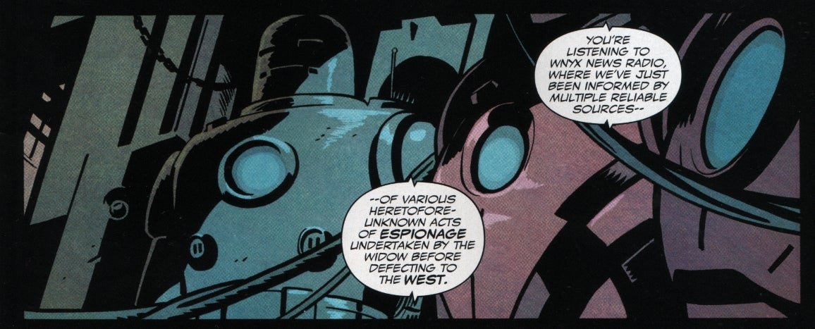
The leap from first to second panel may be helped by the recurrence of hanging wires or cables, a kind of detail also visible in the remaining panels on the page. The second panel shows what appear to be suits of Iron Man armor, distinguished by their round ports or "arc reactors," i.e. the round circles in the chest-plates. Longtime fans may recognize various generations of Iron Man armor in this scene, and even in the second panel alone, which on the left shows what appears to be the very first model Iron Man suit, from 1963 (that would be the one built by Prof. Yinsen). Although Marvel continually updates the origins of characters like Iron Man, so that we no longer talk about Stark becoming Iron Man in 1963, the drawing here evokes that early version; in whatever year the character’s origin is set, the first Iron Man suit is always comparatively crude, bulky, and monochromatic, a “canonical” and expected detail. Such details will help some readers navigate the breakdown of the page, leading to the images of Stark at work in the bottom three panels, and particularly to the final image of Stark in the last panel. As I said, he's pissed.
It helps to consider the ways that the page generates mystery, via withholding information, and yet also builds to an increasing sense of certainty, via visual clues that help readers "in the know" identify where they are (and with whom). There are gaps between the images, ellipses as it were, that we readers may begin to fill in order to make sense of the story. Breakdown (I'm using the term in Robert C. Harvey's sense) refers to the process of dividing a narrative sequence into discrete panels and yet providing enough information for the reader to inferentially "fill in" the gaps. (Bear in mind, though, that at times a comic may wish to confuse or provoke rather than reassure, or may be governed by abstract principles rather than a clear story. That is, breakdown is not always conventional. In cases such as Black Widow, however, the breakdown will usually distribute enough clues for readers to situate themselves in a story-world and "get" a sense of the story.)
Note in particular the word balloons, which, although coming from a radio news program (not from dialogue by characters visible in the panels), give a sense of continuity to this scene, and impose a sense of the flow of time: we can be pretty sure that what happens on this page takes about as long to happen as the words of the radio program would take to be heard. The fourth panel suggests a momentary flinching, or alarm, on Stark's part, as the name of his mentor and savior "Professor Ho Yinsen" is uttered: his hand, holding a wrench in extreme close-up, appears to falter, with a small yet helpful sound effect (CHNK) suggesting an abrupt, awkward move, or pause. If this panel suggests a sudden startle on Stark’s part, the next and final panel gives us a long-deferred close-up of Stark that shows a kind of steely anger: a clenched, tense reaction. The last words on the page are "Tony Stark," and indeed that is whom we are looking at.
COMPOSITION
We've been talking about panel composition (from the Latin compōnere, to put together) in service the breakdown of the page, i.e. the way the page handles narrative ellipsis. We could say many other things about it too. For instance, I note that:
- The dangling wires form lines that serve to isolate visual elements for our attention.
- Likewise, the recurrent round circles in the armor (associated with the character of Stark, his power, and his super-scientific ethos) create a visual rhyme that also guides our attention.
- The atmosphere, dark and cluttered, suggests late-night, hands-on tinkering. In particular, the crescent wrench contrasts sharply with the high-tech lab business usually shown in the Iron Man films—suggesting a more basic and intimate relationship with the technology here. Stark appears to fixing up his own old gear, a setup that would automatically put him (and fans) in mind of Prof. Yinsen in the first place.
- The dusky violets, pinks, and purples contrast to the blue-gray backgrounds, repeating in miniature the prevailing colors of the whole series, where snowy, ice-cold blues tend to vie with purples and shocking reds.
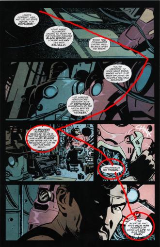
- The word balloons are tail-less, disembodied, and unattributed; the exact identities of the speakers probably don’t matter. The balloons are outlined in a familiar comics way that suggests words coming through an electronic medium rather than from a living source (the fourth balloon on the page allows us to attribute these overheard words to "WNYX News Radio”). Visually, the balloons form an "arrow" shape across the first three panels, as they point, first rightward, then leftward, in a zigzagging pattern. They read across the page in a descending, stair-step shape, a back-and-forth movement that leads to a small, isolated balloon reading "Professor Ho Yinsen" (Panel 4) and then, way down on the bottom right of the page, the bolded words "Tony Stark" (Panel 5, just before the page-turn).
- The word balloons also serve to encircle the early, crude Iron Man armor (Panel 2) and to box in the long shot of Stark (Panel 3).
- Stark's face in the final panel is darkly divided; the blackness that spreads over much of his face bleeds into the surrounding black gutters. One narrowed eye, a slit, is isolated in a big patch of darkness, and almost appears to intersect the gutter line we see in the panels above it, as if caught in the crosshairs (I told you he was pissed!). Again, the blackness of the gutters unifies the page, pulling the panels together.
In sum, there's a flow across the page and down, facilitated by the word balloons, the visual rhyming of circles, the muted but dramatic color palette, the blackened gutters, and the weighty darkness of that final panel: the big reveal of Stark's face, the thing that the whole page has been leading to.
IMAGE/TEXT INTERPLAY
This page leans hard on one cliché of contemporary comic book writing, which is the use of mass media commentary (the radio broadcast) to serve as exposition. Comics have been remediating the work of other media for a very long time; note for example the cooperation or symbiosis between movie serials and comic strips in the early 20th century. Yet this tendency really picked up in the 1980s, when innovative artists like Howard Chaykin (American Flagg!) and Frank Miller (The Dark Knight Returns) began treating comics panels like TV screens or computer monitors, and also dived into satirizing our society’s obsession with television (and mass media generally). In comics by Chaykin, Miller, and their imitators, TV commentators often became a source of exposition as well as a sort of Greek chorus commenting on, or “spinning,” the action. For example, the biting caricatures of media “personalities” in Miller’s Dark Knight—a chorus of voices offering self-interested on-air commentary—underscore the impact that the story’s hero, Batman, has on his society. Usually such media “voices” in comics serve merely as expository devices; we do not usually care about them in the same way we come to care about main characters. They have become a convenient technique for getting across information quickly—and a cliché.

Here, though, the cliché works pretty well. For one thing, the plot requires that Natasha’s secrets be broadcast to the world—so using a literal broadcast to start this chapter makes sense. For another, dividing the exposition into a chain of small balloons allows the storytellers to coordinate text and images in a precise way, so that, as noted above, the reference to "Professor Ho Yinsen" comes as small, decisive shock in Panel 4, and then the reference to “Tony Stark” fulfills the dramatic logic of the entire page in Panel 5. Furthermore, the unfolding of the visual breakdown—that slightly disorienting move from the inside out, i.e. from small details to a deferred establishing shot—is mirrored by the withholding of crucial spoken information until the fourth word balloon, which belatedly confirms that we’re listening to a news broadcast. Once we learn this, the balloons begin to ricochet in the opposite direction, leading our eye back across the page and down.
The exposition here is frankly not very interesting for its own sake—but the way it has been distributed across the page creates a powerful suspense. Further, the precise revelation about the Widow’s role in the kidnapping of Professor Yinsen—which was not revealed in the previous issue—finds apt visual counterpoint in the various suits of Iron Man armor, representing the history of that character and his debt to Yinsen. Here the storytellers dramatically exploit the synapse between successive issues of the comic, #5 and #6, and, closing that synapse, use the interplay of words and pictures to disclose a crucial bit of information, previously withheld. That “reveal” becomes this issue’s big narrative teaser. Note how the cascading text on the page stresses three names—Black Widow, Yinsen, and Stark—and guides the reader back into the story even as it guides the eye down the page. That represents a smart adaptation of a fairly creaky expository device (the radio) to the needs of serial, month-by-month storytelling.
CONTEXT
So—of course—the full impact of this page doesn’t come through unless we look at the larger context of the story, particularly the things that come just before and just after the page. The “before” part, we know, means the ending of the previous issue, #5, with its tantalizing promise of a dustup between two of Marvel’s marquee characters. The “after” part means… turning the page! When you do, you see a big spread on pages 2 and 3: the widest image in the entire comic, in fact, which rather concisely tells us that Tony’s coming, and with a will.
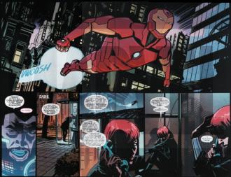
The fierce stare of Stark on the bottom of page 1 sets us up for this spread. To me the page-turn here is a classic case of damn, look at that—a comic book “wow” moment. Page 1 is the fuse, and pages 2-3 a big explosion; together these pages remind me that there is an ebb and flow to comic book storytelling, or a dynamics, not just a perpetual forte fortissimo.
But there’s a greater context beyond these transitions. The Black Widow series poses troubling ideological questions that cannot be gleaned from one page or a couple of issues. To get at those questions, we have to get beyond formalism and think in moral and political terms. For one, the story relies on a kind of Russophobia familiar from Cold War-era spy stories, here revived for the imperial age of Putin. Natasha’s (Soviet-era) past and her still-untold secrets from that time are the engines that drive the plot, and her foes here are Russian too. This is perhaps a bid for topicality. (In issue 6 we learn of a foe who gathers and “weaponizes” information and who calls himself “the Anti-Snowden.”) But there’s a strong whiff of paranoia, too, in this East-versus-West scenario.
BEYOND THIS PAGE: THE BLACK WIDOW AS FEMME FATALE
There’s more, and it has to do with gender and sexuality. The Widow began as an Iron Man villain, and despite her reformed and heroic status, still appears very much a femme fatale. She remains dangerous—which is crucial to her allure, her sexiness and power. Storytellers delight in her seeming amorality and cold-blooded hypercompetence. This particular arc stresses her unpredictability and, more threateningly perhaps, her unknowability. We are given no access to her thoughts: no thought balloons, and no narrational captions in her voice. She supplies almost no exposition. In fact, there are next to no captions in the series at all, and what few there are work simply as functional place-markers (e.g., “Several years ago”). A monologue in issue 6 is the closest we get to Natasha’s version of events, and even that turns out to be a bit of a ruse, i.e. a manipulative trick. (In issue 2, one antagonist asks her, “have you ever gone through even one day telling the truth?”) How far can Natasha be trusted? She will even turn on Iron Man to get to her present objective. She is, all at once, deceiver, manipulator, thief, assassin, and action star—the quintessence of the contemporary femme fatale as hero.
This is not to say that the Widow is unsympathetic, or that we learn nothing about her past: flashbacks in a distinctive red/pink palette give us glimpses of her training, and her perhaps-tragic early life. (One splash page in issue 3 juxtaposes dark images of the Widow in combat with bright red images of her ballet training as a young girl, willowy and graceful; we see that same balletic elegance in the violence she so capably dishes out.) But at no point do we get a thorough and personal accounting of why Natasha is doing what she is doing. She is a hero of few words; in fact, in issue 1 she utters no words at all, until the last page, and even then only a couple of cryptic ones. As she says, “No one gets into my head unless I let them. And I rarely let them.” It seems to me that the streamlined aesthetic cool of Black Widow, the comic, thrives on the inscrutability of the Black Widow, the character, and her capacity to surprise us. She is a risk.
This is a question of ideology as well as smart storytelling, because the Black Widow is a classic example of the phallic woman as heroine: a “dangerous,” dominatrix-type woman that appeals simultaneously to male desires and fears (Jeffrey A. Brown’s 2011 book Dangerous Curves: Action Heroines, Gender, Fetishism, and Popular Culture usefully addresses this topic). Natasha’s inscrutability in the present story enhances this double-edged, threatening/alluring quality, and at multiple times throughout the story she is surveilled or chased by men who are trying to figure her out, men who cannot help but admire her fearsome skill. To some extent, the story pits men’s “readings” of the Widow against her own revealing flashbacks, which are the only hints of interiority in the character. She may be our heroine, but she’s an enigma too.
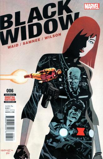
We cannot see this on the page I’ve chosen, because that page positions Tony Stark as the focal point of the drama. But even as Stark flies off in a rage to confront Natasha, she takes over the storytelling once again, and remains a step ahead of him. The cover of issue 6 cannily exploits the Widow’s iconography, and Iron Man’s, to show how deeply and intimately she has hurt him: there one of the moonlike circles that makes up her belt becomes the very circle in Stark’s chest, that is, the arc reactor or power source that sustains his life. Stark and Yinsen are enclosed in the silhouette of her body, while the nearness of Stark to her red “widow” insignia/belt buckle—a fairly recent addition to her costume—is, er, likewise intimate.
Samnee manages to downplay and yet at the same time craftily exploit the Widow’s silhouette, her “look.” Her fetishistic costuming, I note, marks her as one of many coolly professional phallic women heroes in comics and in pop culture. There’s a lot of precedent for this sort of thing, from Tarpé Mills’ Miss Fury comics (1941-1952); to the heroines Cathy Gale (Honor Blackman) and especially Emma Peel (Diana Rigg) in the 1960s British television series The Avengers (a spy series unrelated to Marvel’s Avengers); to the redesign of Catwoman (Julie Newmar, Lee Meriwether, Eartha Kitt) in the mid-60s Batman TV series.
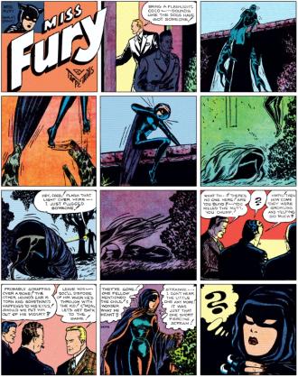
A Miss Fury Sunday newspaper strip by Tarpé Mills (1945)
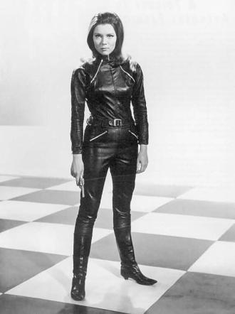
Diana Rigg as Emma Peel, from The Avengers (c. 1965)
Though Natasha first appeared in the “Iron Man” series in 1964, it was in 1970 that artist John Romita (Amazing Spider-Man) redesigned her, creating the familiar catsuit, reportedly in homage to Miss Fury but at a cultural moment where readers could not help but see Emma Peel as an influence (the Avengers had drawn attention for its mild mainstreaming of kink, i.e. fetish fashion). Romita’s catsuit has been the favored design ever since, despite inevitable variations, and is the template for the film version of the Widow. (DC’s Catwoman, another villain turned ambiguous hero, has been redesigned to reflect all these influences, and nowadays looks rather like Miss Fury.) All of this makes the Widow an obvious example of the ambivalence embodied in the contemporary action heroine: at once an attractively independent hero with agency, drive, and tremendous skill and a threateningly phallic killer, unpredictable, evasive, and possessed of a stone-cold cool (La Femme Nikita, The Bride in Kill Bill, etc.). It’s fair to say that character type is, um, troublesome, as it personifies masculine fears and desires in a blatantly fetishistic way.
So: the character's look has everything to do with her characterization. That said, Samnee, Waid and company depart from other recent Black Widow comics by downplaying (relatively) her sexiness and by interpolating elements from her past that serve to humanize her somewhat, even as the main arc of the story maintains her aura of unknowability and cool. That is, they perform a balancing act that keeps the character “dangerous” while ratcheting down the level of fetishism and sexual threat so often emphasized with this character. In a sense, they win our sympathies with a more humanistic portrayal than one might expect for a heroine coming from such a phallic, masculinist template. It’s no accident that the Widow has been relaunched in this manner even as the Marvel films, with Scarlett Johansson as Natasha, have charmed millions of viewers, women as well as men.
The opening page of issue 6, though, by bringing Tony Stark’s grief and rage into the spotlight, suggests the trouble that such femmes fatales continue to pose for the masculine superhero. Even as Samnee, Waid, and company stress Natasha’s humanness, they remind us of what a threat she can be. Without giving any spoilers away, I can say that by issue’s end the character remains morally ambiguous and her future plans seem… dicey. What makes all this work is the poise and restraint of the visual storytelling, which maintains a tightrope-walker’s balance between disclosure and concealment. It’s impressive work—but we should remember that this back-and-forth between revealing and concealing has an ideological, specifically a gendered, element. Samnee and Waid's characterization wavers between sympathetic interiorizing and a fearful fascination with the Widow's untrustworthiness. The comic is a play of attractive surfaces and morally ambiguous revelations that suggest just how "fatale" Natasha can be.

